
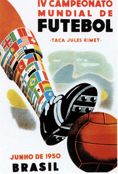
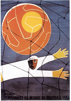
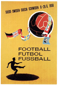
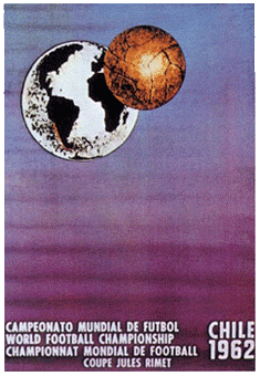
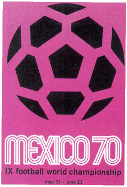
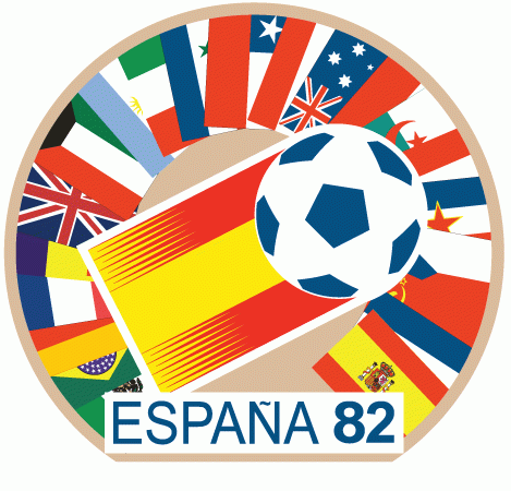
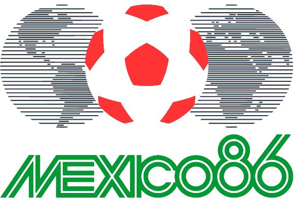
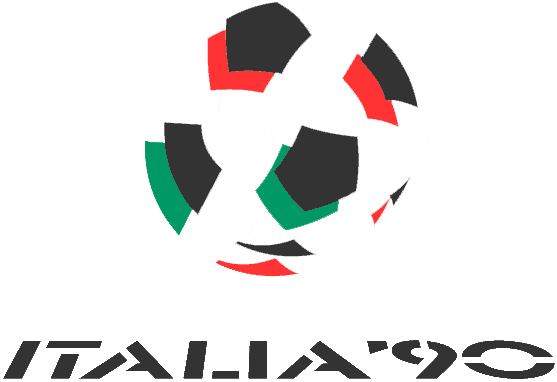
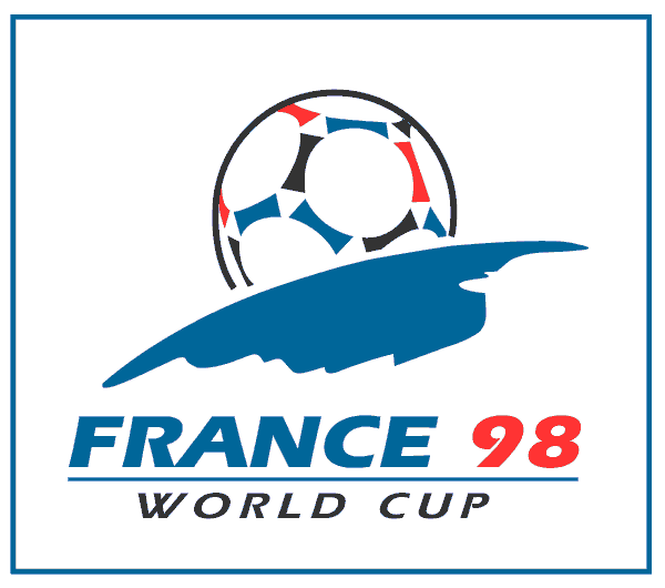
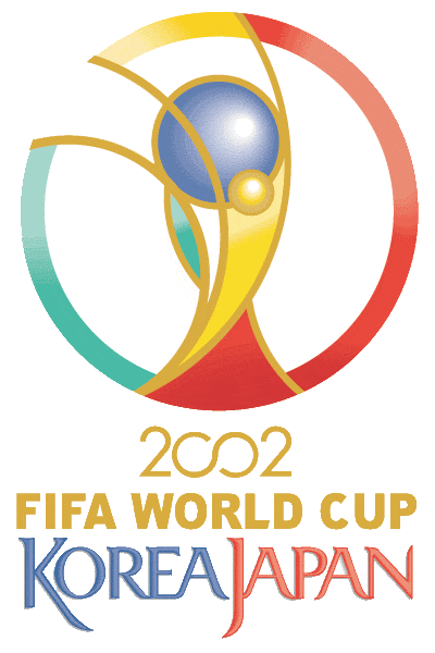
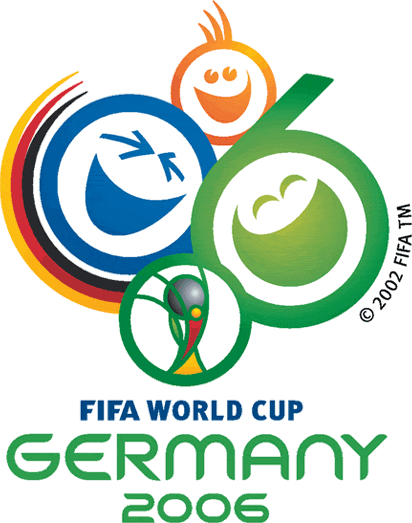
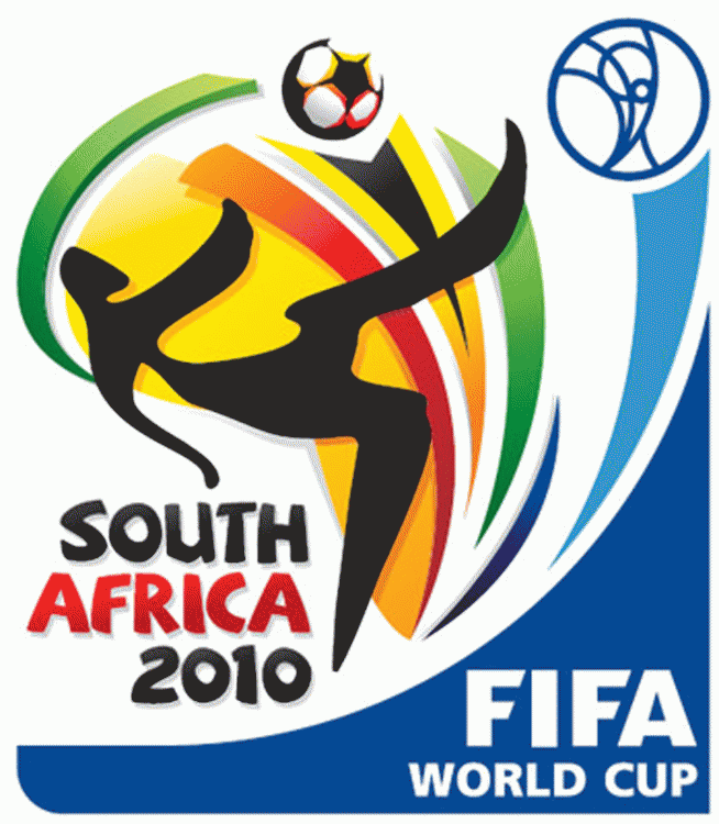
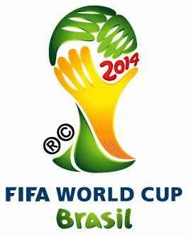
As we’re nearly ready to kick off the World Cup in Brazil, everyone here at Graphic Tide have been pulling in the man hours to put a small collection of art inspired World Cup blog posts together, to help inspire you for this great event. Today we’re featuring a collection of all the tournament logos used to promote the competition going back to the 1930’s.
Like all major sporting events, the logo is normally the first thing released, sometimes 10 years before the tournament even starts! So what better way to get into the football spirit then a look back at some of the previous World Cup tournament logo’s. We’ve also featured the logo for next World Cup in Russia 2018!
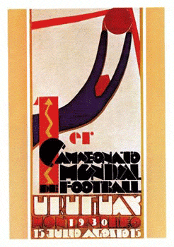
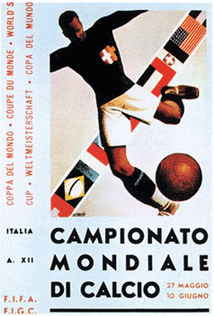
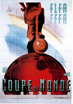
You’ll see it’s how the style and technique has changed over the past years and how some themes continued from one tournament logo to the next. The logo’s started out as what you would rather call a poster than a logo, but over time these have evolved into logos. It wasn’t until the late 80’s that this changed.
I hope you’ve enjoyed this mini build up to the World Cup so far, if you’ve missed any check out the Graphic Tide’s football tag or you can start from the beginning. We provide free action packed blog posts with the intentions to help inspire you with your next project, whilst getting you into the football mood!
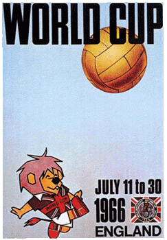




So thanks for visiting today, be sure to leave a comment below, as we would love to hear from you. Which logo was your faviourate? For me it was the England 1966 logo/poster. Be sure to follow us on Twitter, Facebook and Tumblr, it will be great to see you on there. Thanks again, and have a great day!
